Worked in the Brand team to design badging logos for electric cars, including their special edition versions.
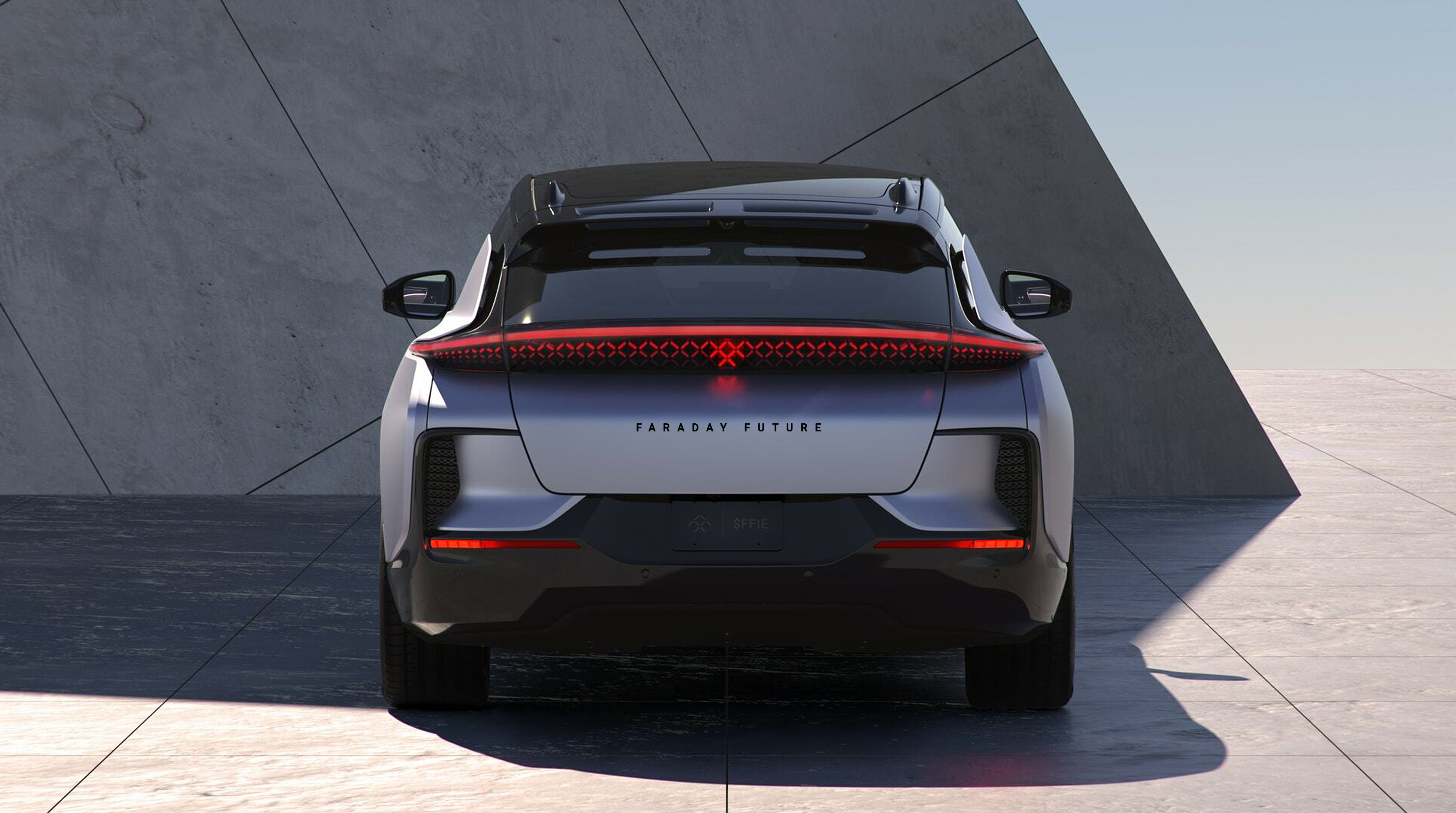
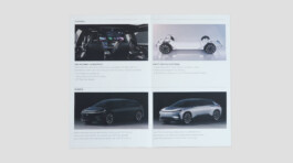
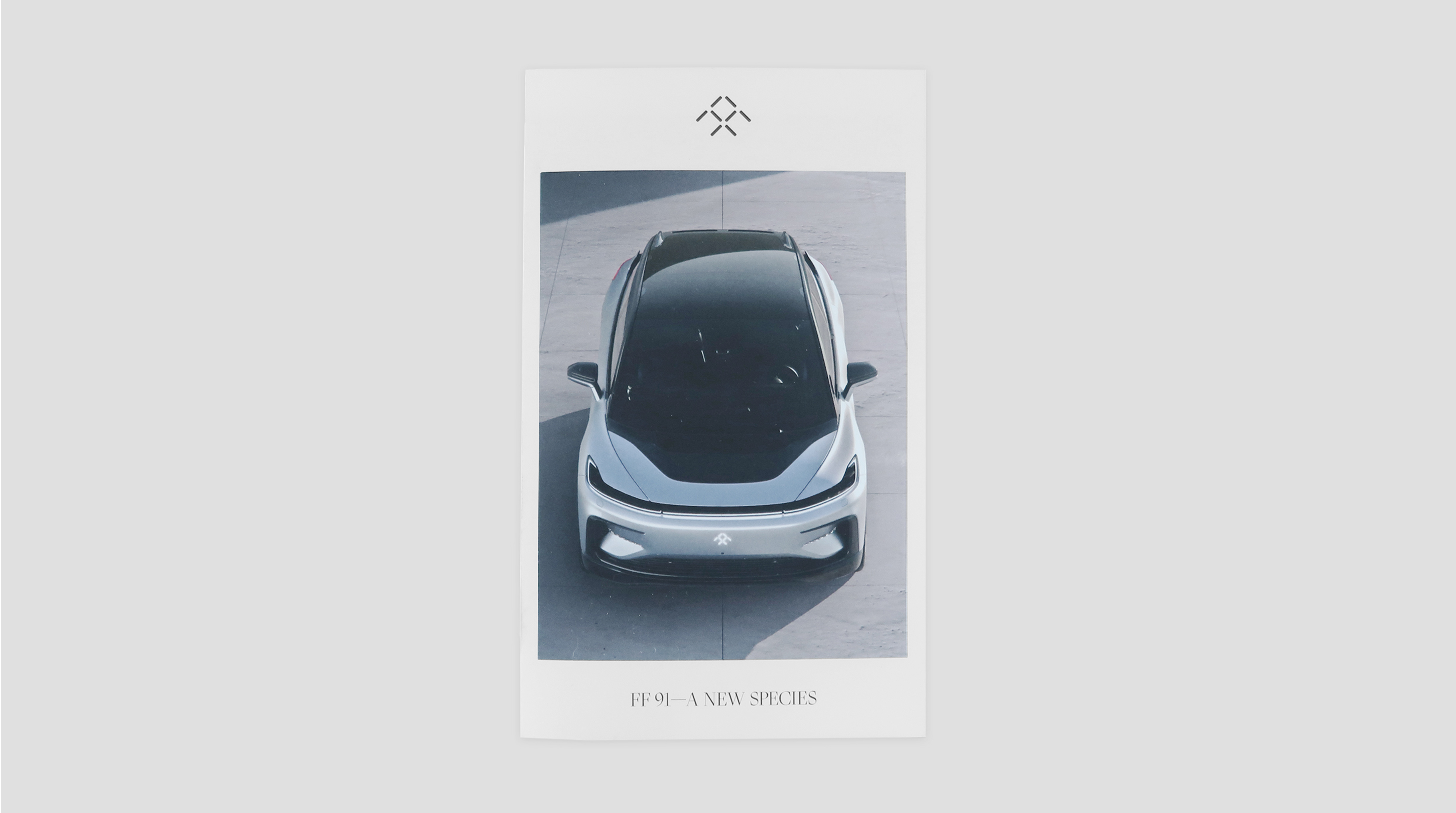
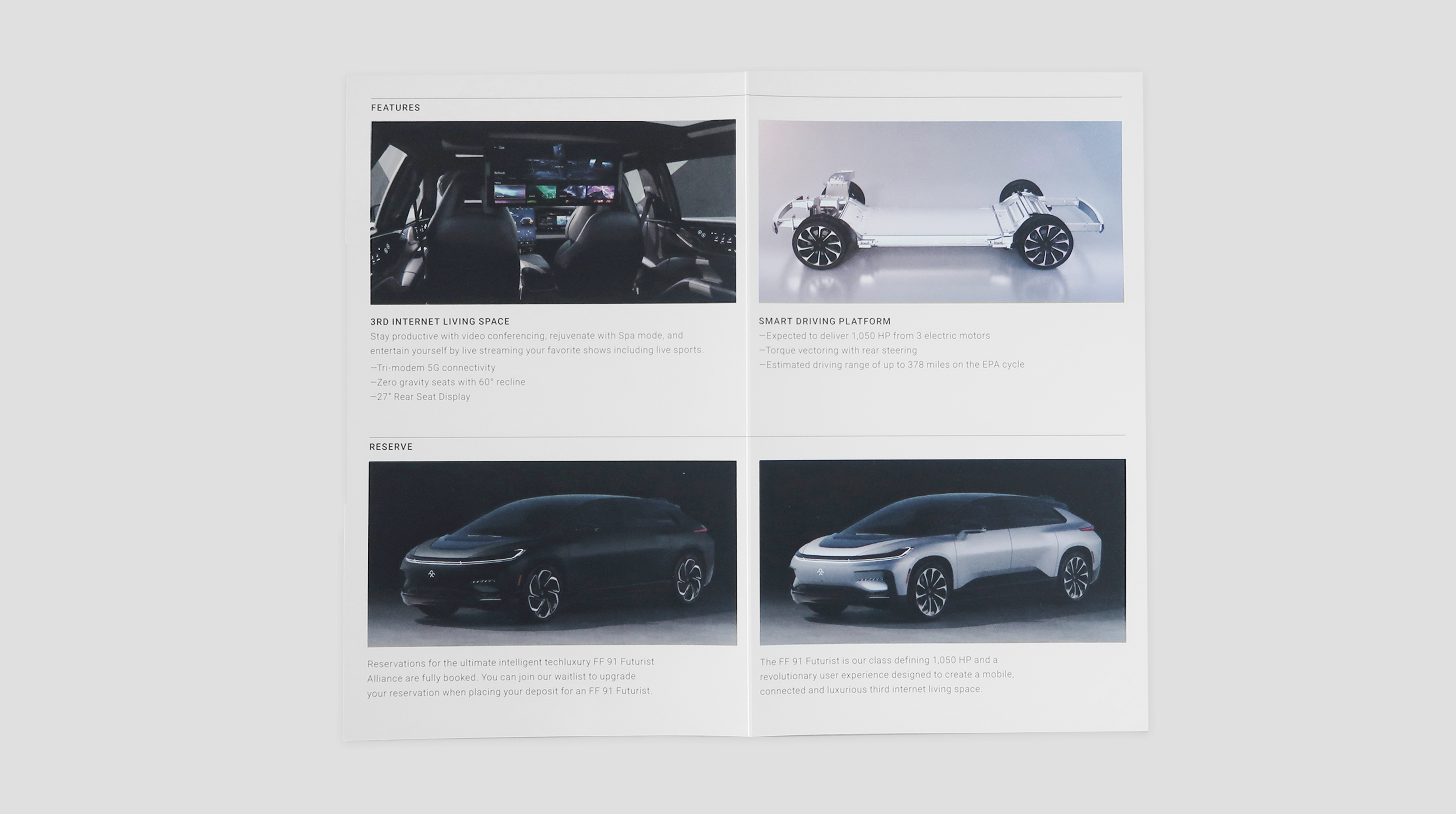
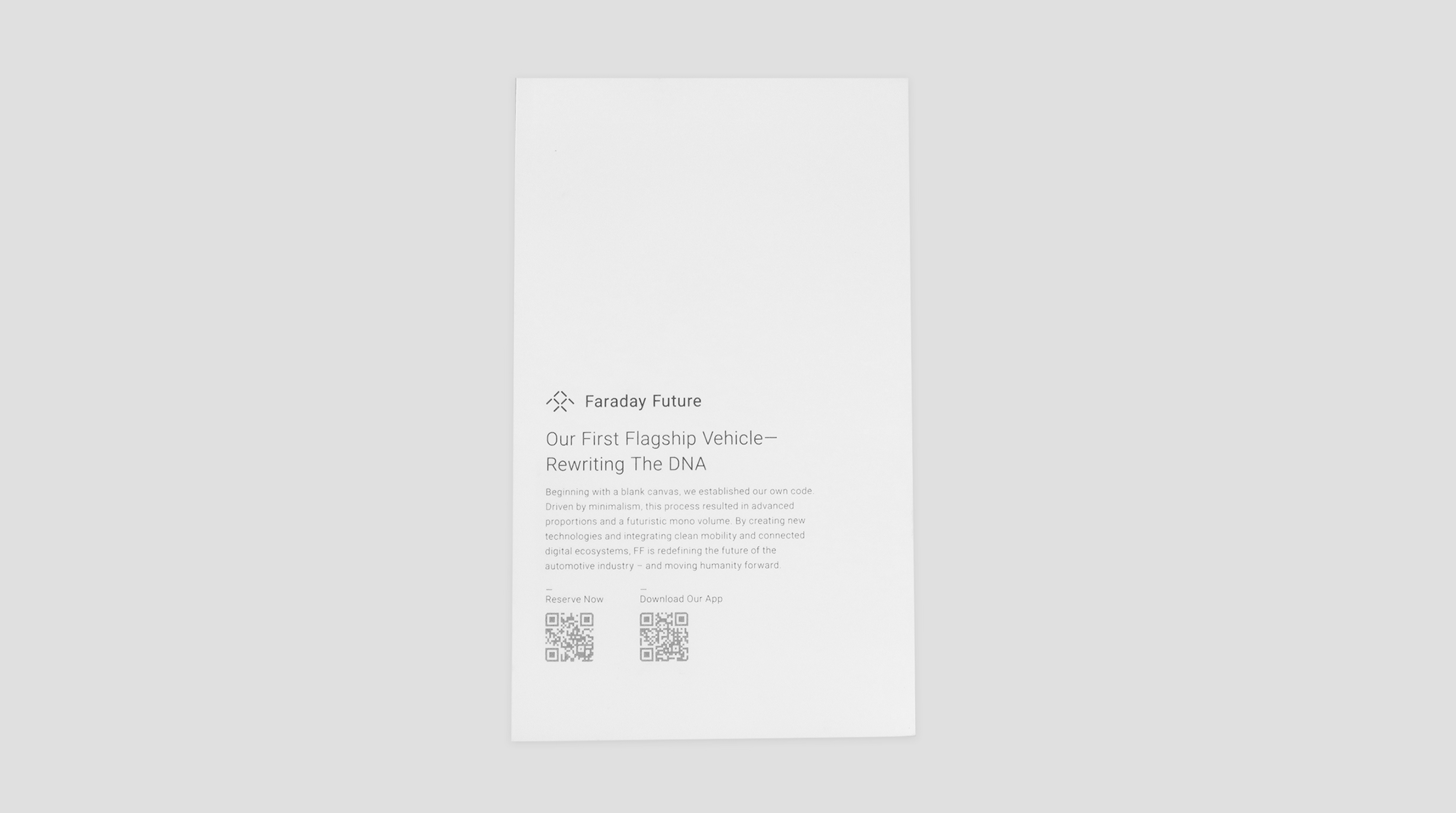
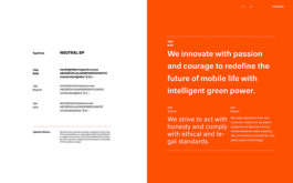
A brochure that explains the Faraday Future FF 91 features and its brand.
This digital campaign was designed to focus on key audiences with the intent to purchase a vehicle.


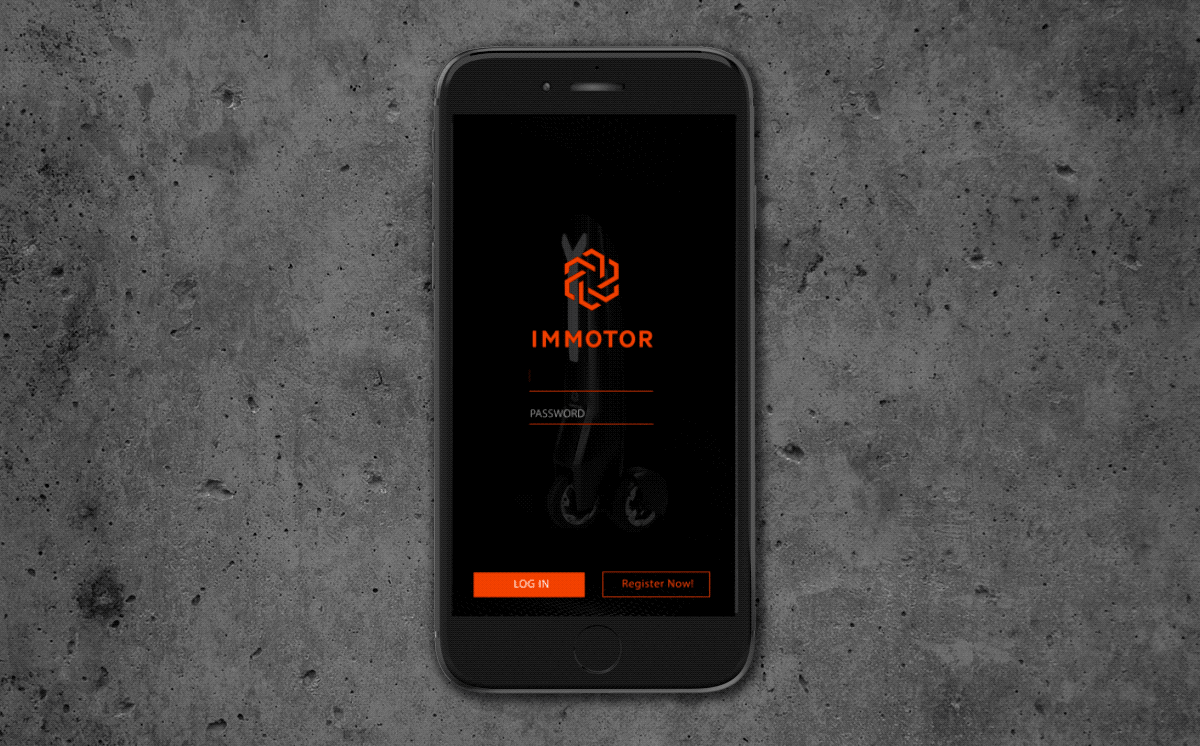
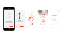
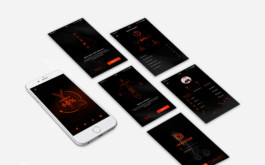
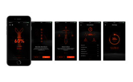
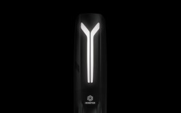
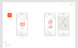
This is designed for riders to customize their scooters and program lights, horn, speed settings, and distance restrictions.
The design concept is to be simple yet dynamic, using simple icons to navigate and control.
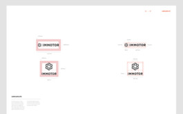
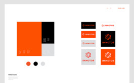
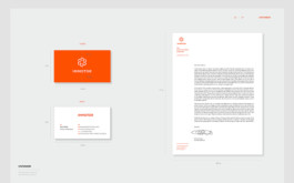
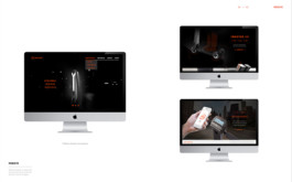
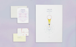
Created a brand guideline based on their existing logo. Worked on redesigning the identity system, including a website, application, and stationery.
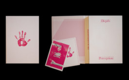
Vito Acconci was a pioneering American artist known for his performance, video, and installation work. Over time, his practice expanded to include sculpture, architectural design, and landscape design. This book is dedicated to Vito Acconci, aiming to showcase his approach of using proximity through his performances and interactions with people.
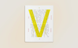
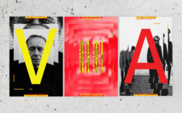
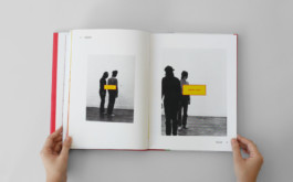
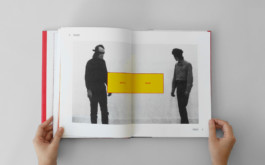
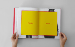

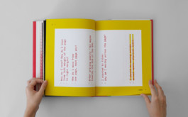
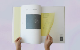
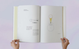
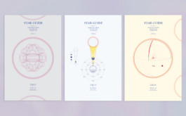
A book is redesigned to engage readers visually by incorporating redrawn graphics and simple typography. The concept emphasizes using proximity and spacing through typographic treatments on each page. Negative space is employed to evoke the idea of galaxies and outer space. All illustrations are redrawn to align with this theme.
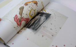
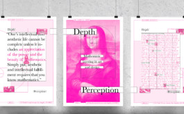
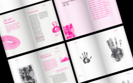
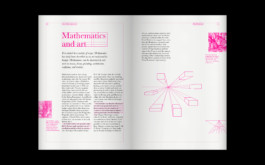
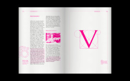
An exhibition book featuring artists who incorporate mathematics into their works. My idea is to showcase the grid system throughout the book to highlight mathematical concepts.
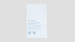
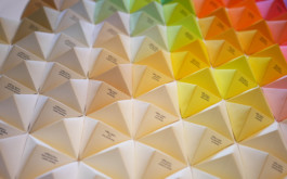
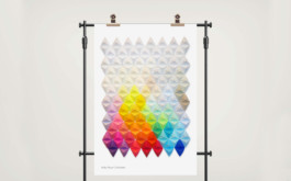
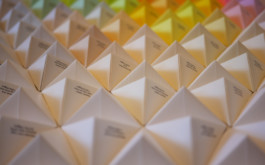
Kelly Paper, a paper merchant based in Los Angeles, offers a diverse selection of paper, packaging, wide format, and digital products for print and graphics. For my information design, I aimed to display all the text weight papers from Kelly Paper. My concept was to fold origami models to showcase the various papers from different perspectives, using light reflection to highlight different colors and textures. All paper details are printed on the left side.
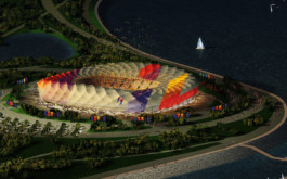
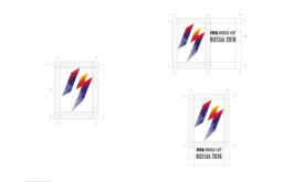
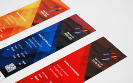
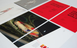
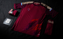
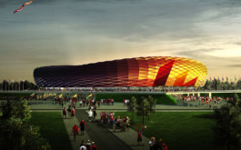
I was assigned to create a branding system for the FIFA World Cup 2018 that energizes audiences worldwide. The logo's design is inspired by the angles of a soccer player's movement on the field. The color palette transitions from red to blue, symbolizing sunrise and sunset during a game. Photography employs a 20° angled slice effect to introduce dynamic movement across all images.